KARACHI: Natasha Noorani has recently come forward with her latest song, ‘Choro’. And from what it seems, the song is a tribute to the toxicity of relationships, be it any.
Surrounded by flowery fields, in colors happy but pastel in nature, Noorani can be seen walking around in an enclosed studio. This depicts how enclosed she feels with all the love around her. The choice of pastel colors has worked very smartly. Not only does it give an aesthetic appeal to her frames, but also hints towards all the colors not being their fully saturated selves. Repressed and a little desaturated. According to popular perception, when you are in love, all the colors feel more vibrant, particularly those of flowers. However, the case here is different.
View this post on Instagram
She is tangled in threads for one of the sequences, immobile. This seems to be symbolic of relationships that make you restricted, with you feeling like anything you do can only worsen the situation between you and the other person.

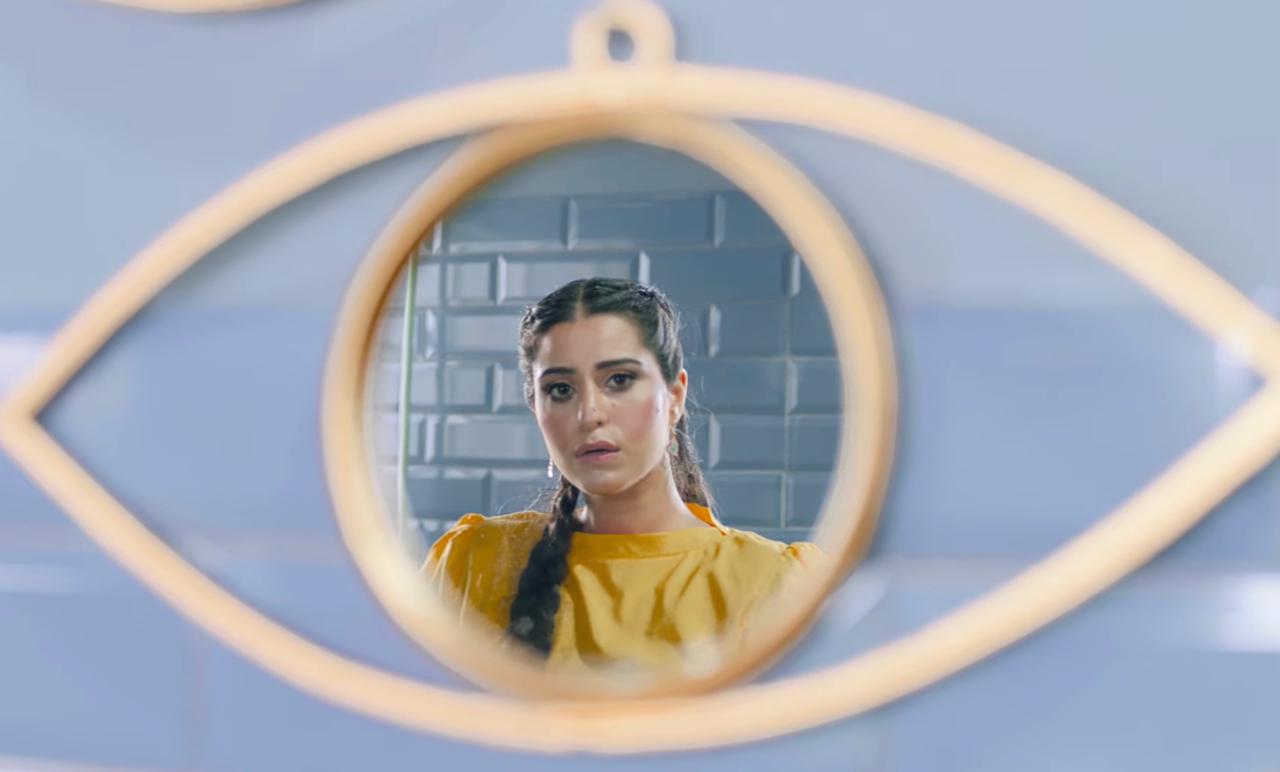
The eye above Natasha Noorani watches her as she sits down and goes about her day, singing her song. The mirror on that eye is how she views herself. This depicts two things: 1. a feeling of being watched, and 2. our perception of ourselves through the eyes of people who we love. It is perhaps the mirror that urges her to keep trying, and in spite of the fact that she is up in flames as the chorus of the songs suggests and wants to let go, she still sticks around. Love keeps her stuck.

Hashim Ali has done a stellar job with the look and feel of the set. It thoroughly compliments the narrative and reflects in the lyrics as the song progresses. It is important for the creatives to mirror the visuals and push the story forward than simply be there to look pretty. His art direction achieves a lot more than just aesthetics.
View this post on Instagram
As far as the music goes, the feel mirrors that of most of Abdullah Siddiqui’s productions. The song has a rather peaceful mood to it. A vibe you would enjoy on a lazy day. The feel, however, also compliments the state of the character in the song. Someone who would stay in a relationship because it is harder to let go. While the feel does not depict the absence of a struggle. It does depict her surrender. The beat is consistent, much like the consistency of a relationship you have had for a long time. The comfort of that consistency envelopes you and becomes your home.
Natasha Noorani herself fits in perfectly with her vocals. They too, like the beat, are consistent. The only high we experience is during her chorus, but that too becomes consistent. Her voice is soft, sometimes whispers of things she would never say out loud expressing that there is actually a lot she wants to say, but does not. The lyrics suggest her internal battle. On one hand, she wants to let go, on the other, she wants the same person to never leave and stay in her heart.
The following lyrics might do well to explain the aforementioned idea:
Choro yeh hath
(Let go of my hand)
Mein aag mein kharri hui
(I am standing in fire)
Aag mein yun bheeg chuki hun dekho zara
(I am drenched with fire)
Ankhon mein dekh key batao
(Look into my eyes and tell me)
Tum door na kho jao
(That I will not lose you)
Aao merey pas aao
(Come, come to me)
Dil mein kahin bass jao
(Reside somewhere in my heart)
The song has been written and composed by Natasha Noorani herself. Abdullah Siddiqui and Noorani, both serve as the producers. It has been mastered by John Davis at Metropolis Studio in the UK while the artwork has been done by Senna Ahmed.
As far as the video goes, it has been directed by Noorani and Abdul-Rehman Malik with Bilal Khan as the producer. It would be wrong to say that the color grade, the lighting, and the direction of photography have not played a part in accentuating the storyline. Kudos to Awais Gohar and his team for achieving these visuals. The lighting is soft, giving the video a feeling of comfort, and sits beautifully with the soft colors used by the art team.